Blog:
Azure IoT Hub on a Toradex Colibri VF61 – Part 3: Using cloud services to collect business intelligence
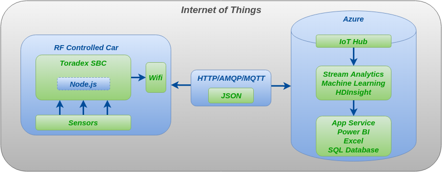
This is the third – and final – part of a series of articles introducing how to start developing an IoT solution. It focuses on using the cloud services provided by Azure to provide easily understandable data visualization and business intelligence. The embedded system chosen for this purpose was a Toradex customized SBC solution: the Colibri VF61 SoM + the Iris Carrier Board. In retrospect, Image 1 presents a block diagram that illustrates the idea of the whole application documented in this series of articles.
If the reader wants to gather more details about this project, as well as how to send data to the cloud, it is possible to get it in the previous two articles of the series:
Azure is a cloud services platform by Microsoft that allows for a wide variety of applications, such as databases, virtual machines, app services, machine learning, data stream analysis, media services and CDN, big data solutions, among many others. The Azure services are mostly Iaas and PaaS – Infrastructure as a Service and Platform as a Service, respectively. The IoT Hub was previously configured to receive messages from devices, therefore its use will be transparent from now on, but there are two more Azure services chosen to fulfill this project's goals:
Stream Analytics is an Azure service that processes near real-time data and generates outputs to dashboards, alerts, feeds databases, compares data streams and historical series, etc. Some of its benefits are the easiness of use, since just a few clicks are required to have it configured and running; the fact that the data filtering is described using an SQL-like language; the huge scalability, which allows the system manager to configure a throughput ranging from 1MB/s to 1GB/s depending on the project needs; and the low cost, since there are no implementation fees and payment is made as the service is used.
Power BI is a Microsoft cloud service that is not part of Azure, and it is focused on business intelligence and data visualization, and though it is not part of Azure, there is the possibility to use the Stream Analytics among its data sources. The Power BI displays data series in dashboards that show online relevant information that a manager could use for decision making or insight gaining. The fact that the dashboards are constantly refreshed allows for problem solving and seizing opportunities as fast as possible.
Now that the cloud services needed for this project are presented, the next section focuses on how to configure them.
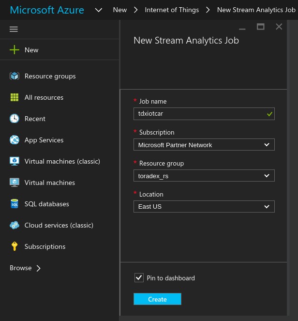
Now that the IoT Hub is getting data from the embedded system, it can feed the Stream Analytics, which is the first service to be configured. In the Azure portal, select +New > Internet of Things > Stream Analytics job, as illustrated in Image 2. Then a Job name must be chosen and the same resource group and location used in the IoT Hub must be selected.
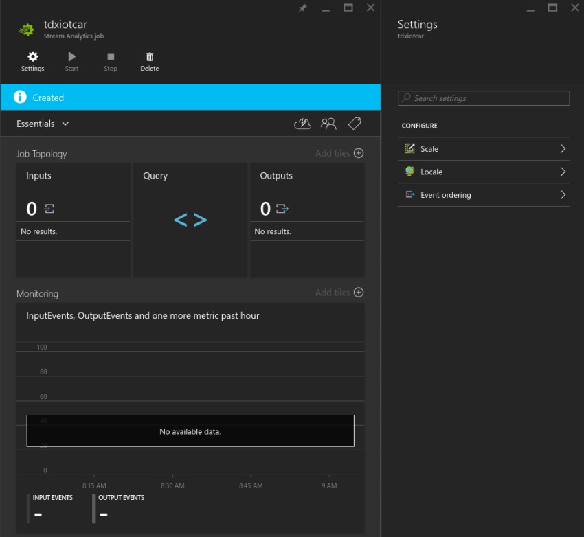
After the job is implemented, it can be accessed from the main portal page, and the resulting visualization is as illustrated in Image 3. The section Job Topology presents some information and the configuration of Inputs, the Query description and the configuration of Outputs - topics that will be addressed individually along this article. The Monitoring plot is configurable and displays information such as the number of inputs and output events over time, data conversion errors, out of order events, and other options. There is also a Settings tab for additional adjusts.
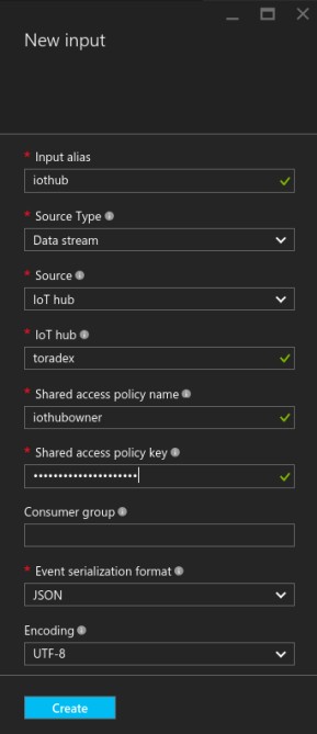
To configure the IoT Hub as an input, the field Inputs must be clicked and, the add option selected in the new tab. The tab new input will open as shown in Image 4. Any Input Alias can be used; the Source must be selected as IoT Hub and the fields IoT Hub, Shared Access Policy Name and Shared Access Policy Key must be filled with the IoT Hub information (it was described in the first article of the series how to get this data); all other fields can be left filled with the default values.
Before configuring the Power BI as an output, an account must be created since this is not an Azure service. It can be done in the Power BI website and the basic version is free. After registering, the screen will be redirected to the Power BI interface, but it can be left aside for now, because it is required to configure the Stream Analytics output first.
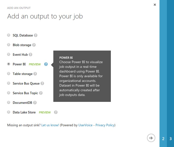
The connection between both services is a recent feature and it can only be done in the management Azure portal. When it opens, the Stream Analytics job must be selected from the All Items list, then the outputs tab and, on the page footer, there is the add output button. Select Power BI in the recently opened window, as shown in Image 5.
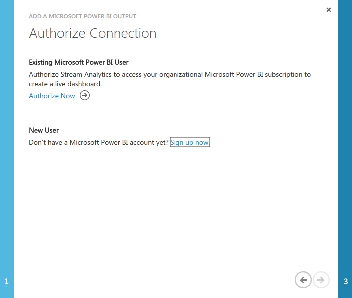
When requested, authorize the connection, as illustrated in Image 6, by clicking the Authorize Now link. Log into the Microsoft account to which your Power BI is linked.
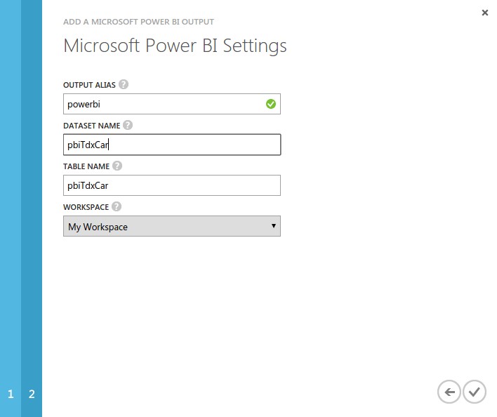
Choose an output alias, dataset name and table name, as exemplified in Image 7. If you want, the same name can be applied to all the fields. Now the Stream Analytics output is configured to send data to the Power BI.
Since the Stream Analytics behavior is written in an SQL-like language, it can be interpreted as a data filter, in which the information goes to the output only when the specified conditions are met. To illustrate the possibilities, the query implemented in this example does two distinct tasks: it groups input data in a 10 second window, with the goal of reducing the output data load, by using a tumbling window. For instance, if the embedded system sends data every 1 second to the IoT Hub, for every 10 input objects, only 1 will be sent to the Power BI. But which of them will be chosen? Isn’t sending more data points better?
Answering the first question, the data can be grouped by using some aggregate functions, such as sum, average, standard deviation, maximum value, number of occurrences or some sorting function. For detailed references, check the documentation. Regarding the second question, the advantage of using a window is that, if the output application has a data ingestion threshold, the window can keep the application within the limits without losing the data meaning. In this particular project there is only one embedded system sending data to the cloud, so this is not a concern, but when there are thousands of devices connected, or even a small number of devices sending many messages, it then makes sense to use the windowing option.
The second main task that the query does is to identify the driver's risky behavior or even an accident, by sending to the output only data that meets these conditions – whenever the driver is too close to the next car, in a sudden braking or even a car overturned. These conditions can be useful depending on who is watching the Power BI dashboards: if the manager wants to study the relationship between car temperature and distance from the next vehicle for instance, the filters applied here won't be very useful, which leads the IoT developer to ask the question: what output do I want?
The implemented query code is presented below. Note that in the SELECT section, the max, min and avg functions were used to group the variables to the window, while some variables were also renamed; A count function it was also applied to hypothetically hold the number of accident or risky situation occurrences. The section INTO tells to which output the data should be used and it must hold the output alias previously configured. The same applies to the section FROM, except that it tells which input to use. The GROUP BY section defines the window time and the variables that are not grouped, such as identification strings and the section WHERE holds the risky situations filter. Note also that this filter is a simplified model that could be improved for a real life situation, by using more comparison variables and other mathematical refinements.
SELECT
System.Timestamp AS myTimestamp,
   ObjectName as carIdentifier,
   Avg(temp) AS temperature, -- degree celsius
Min(acceleration.accel_x) AS accel_x, -- metres per second squared
Max(acceleration.accel_y) AS accel_y,
Min(acceleration.accel_z) AS accel_z,
Max(gyroscope.gyro_x) AS gyro_x, -- degree per second
Max(gyroscope.gyro_y) AS gyro_y,
Max(gyroscope.gyro_z) AS gyro_z,
Max(CAST(gps.latitude AS bigint)) AS latitude,
Max(CAST(gps.longitude AS bigint)) AS longitude,
Max(CAST(gps.altitude AS bigint)) AS altitude,
Max(CAST(gps.speed AS bigint)) AS speed,
Min(distance) AS distance,
Count(Min(distance)) AS accidents
INTO
   powerbi
FROM
   iothub
WHERE
--car overturned
   acceleration.accel_z < 0
--sudden braking (randomly chosen value)
   OR acceleration.accel_x < -2
--too close to the next vehicle while at high speed (> 40km/h)
   OR (distance < 1.5 AND gps.speed > 11.11)
GROUP BY
TumblingWindow(ss, 10),
ObjectName
To start the service, just go to the Stream Analytics job in the Azure portal and click start. This may take anywhere from a few seconds to a few minutes.
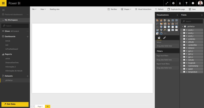
The first steps in order to create a Power BI dashboard are to check that everything is on and running: the Stream Analytics job, the IoT Hub and the Toradex embedded system. Then, by accessing the Power BI through the browser, the left tab will hold a menu named Datasets, in which the Stream Analytics output data will automatically show (it will not show unless the Stream Analytics filter send at least one data to the output). Select it and the screen will be as in Image 8.
Now it is possible to choose a data visualization option, such as a line graph or a table. In this article, bar graphs will be employed in the risky conditions and accidents visualization, as well as a meter to indicate how many of these situations occurred. Besides the standard visualizations, it is possible to create custom models or even download community customized models.
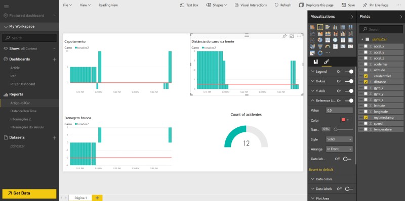
As an example, let's create a stacked column chart. The value mytimestamp is added to the axis, caridentifier to the legend and distance to the value, as indicated in Image 9(a); also the legend and title are edited, and a reference line is added with a value of 0,5 to facilitate the awareness that a car is too close to the next vehicle. This editions are described in Image 9(b). Image 10 illustrates this graph beside other graphs for car overturned and sudden braking, as well as a meter with the accidents count. Before going to the next step, the current report is required to be saved.
values-part-3-azure-iot-hub-blog.jpg)
(a)
values.jpg)
(b)
To see the charts updating in real time, it is needed to add them one by one to the dashboard. Unfortunately, adding the report itself requires the page to be reloaded in order to refresh the data (at least until this article was written). First, a new dashboard is created from the left tab, previously shown in Image 8. Then the report is accessed and, in the right superior corner of every chart there is the option pin visual, that add the chart to the dashboard.
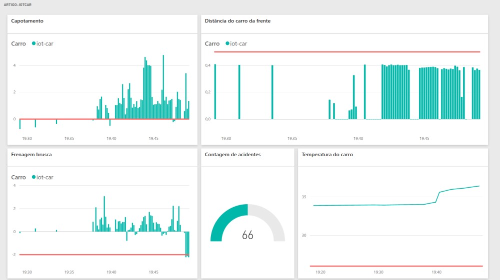
Image 11 presents a result with data sent from the car, but there are some scenario considerations: in order to acquire data from a real car, the remote controlled car was taken for a ride. To satisfy the filtering conditions imposed by the Stream Analytics, the lateral acceleration was used as if it was the gravity, because it has negative values from time to time; the car acceleration was used as is; the car distance is almost always lower than 0,5m because of the remote controlled car positioning inside the real car. Also, the system was not equipped with an internet connection such as 3G or Sigfox, which led to the use of a smartphone as a Wi-Fi router. Below the image, there is also a video showing the real time dashboard, as well as a temperature chart creation and generation of a PDF document from a dashboard screenshot.
And this brings us to the end of a series of articles regarding how to create an end-to-end IoT application. It is only an overview for those who wish to explore this area, or an introductory guide if one wants to have an idea about the Internet of Things, since there are numerous possibilities unexplored here, as well as scenarios to which the Toradex embedded system is suitable. Hope this article was useful and also, I would like to thank the Grupo Viceri team from Brazil for their expertise regarding Azure and Business Intelligence that led to the partnership that which resulted in the IoT Car project. See you next time!
- http://developer.toradex.com/knowledge-base/azure-iot
- http://developer.toradex.com/knowledge-base/azure-iot-device-sdks-for-linux
- http://developer.toradex.com/products/colibri-vf61
- http://developer.toradex.com/products/iris-carrier-board
This blog post was originally featured on Embarcados.com in Portuguese. See here.